The Swiss Post brand – trust across generations
Swiss Post is one of the oldest and most recognised brands in Switzerland. It has long connected people and is an integral part of the country. It is part of Switzerland’s identity.
Swiss Post remains true to its tradition and values while staying in tune with the times. It aims to continue playing a connecting role in people’s lives. It is close to people and a reliable partner in everyday life.

Our Swiss Post brand today
The logo is a unifying element across language regions. It represents both tradition and innovation and reflects how Swiss Post is evolving and shaping its future.
The modernised logo of the Swiss Post
Loading consent details...
175 years of the Swiss Post brand
The evolution of the brand since 1849
1849: Successful launch of the Swiss Federal Post Office
The history of the Swiss Post brand began in 1849 with the centralization of the postal service regulated by Swiss federal law. The first Swiss Post logo shows the Swiss cross as a coat of arms, adorned with a post horn, alpine roses and oak leaves. The original logo dominated letter boxes, Postbuses and the public domain until well into the 1930s.

1920: New directions in eventful times
Swiss Post’s new logo oozes symbolism: it shows the Swiss cross framed by a corona, surrounded by alpine roses and an arc with 22 stars which probably represent the number of cantons. Add to this the post horn with lanyard and tassels. A telegraph pole is shown on the logo for the telegraphy/telephony unit instead of the post horn.

1928: Swiss Post and telegraphy/telephony merge
At the end of the 1920s the Swiss Post and telegraphy/telephony divisions start to align their organizations. Their own brands remain intact in the logos. The design is visibly pared down. The core elements Swiss cross and post horn or telegraph pole continue to shape the character of the logos.

1930: One coat of arms, two brands
In 1929 Swiss Post and telegraphy/telephony appear for the first time in their year books with a square coat-of-arms logo. Swiss Post uses a simple gold post horn. A pole with insulators and wires depicts the telegraphy/telephony unit. The continually adapted coat-of-arms logos are partly used until the 1990s.
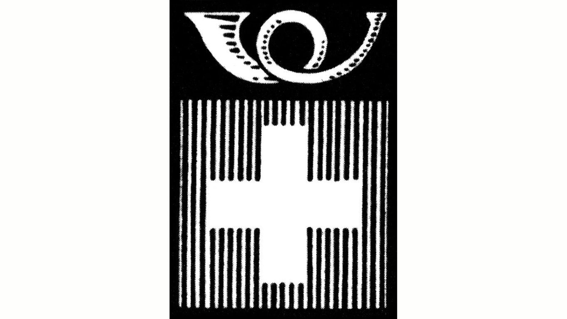
1932 - Swiss Post appears together with telegraphy/telephony
Swiss Post and telegraphy/telephony are combined into a single brand and appear with the established square coat-of-arms logo. The Confederation officially permits the PTT to use the Swiss cross. This means that the use of the coat of arms as a trademark is now regulated from a legal standpoint.

1937: PTT moves into the frame
The PTT abbreviation in gold lettering on a black background is added to the logo. The PTT lettering is now used as a uniform abbreviation for the “Swiss Postal, Telegraph and Telephone Administration”. These three letters are an integral part of Swiss Post’s corporate logo until the break-up of PTT at the end of 1997.
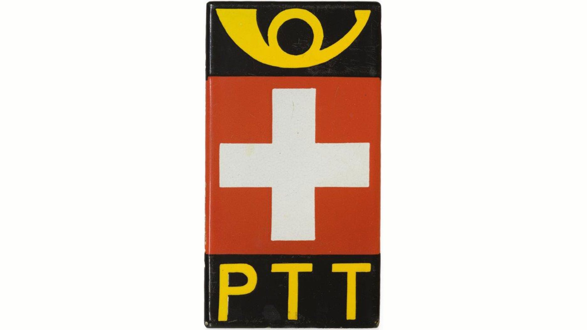
1941: Coat-of-arms logo ever-popular
For the first time in Swiss Post brand history the post horn is not used in the logo. The new logo is square and better proportioned. The Swiss cross dominates the design – possibly as a patriotic sign during the uncertain times around the Second World War.

1982: Seeking a modern corporate identity
In the 1970s Swiss Post addresses topics such as corporate identity and corporate design for the first time. The logo designed by stamp graphic designer Martin Altenburger, is perfected by typeface designer Adrian Frutiger. In 1982 the new logo is approved by Swiss Post. However its use only becomes binding from 1992 onwards.

1994: Swiss Post and Telecom PTT demerged
In 1994 Swiss Post launches the trilingual “Swiss Post PTT” brand and the independent brand “Telecom PTT”. This brand identity is, however, only a temporary solution. On 1 October 1997 Telecom PTT becomes independent and officially called “Swisscom”. Swiss Post replaces “Swiss Post PTT” with the current name “Swiss Post”.
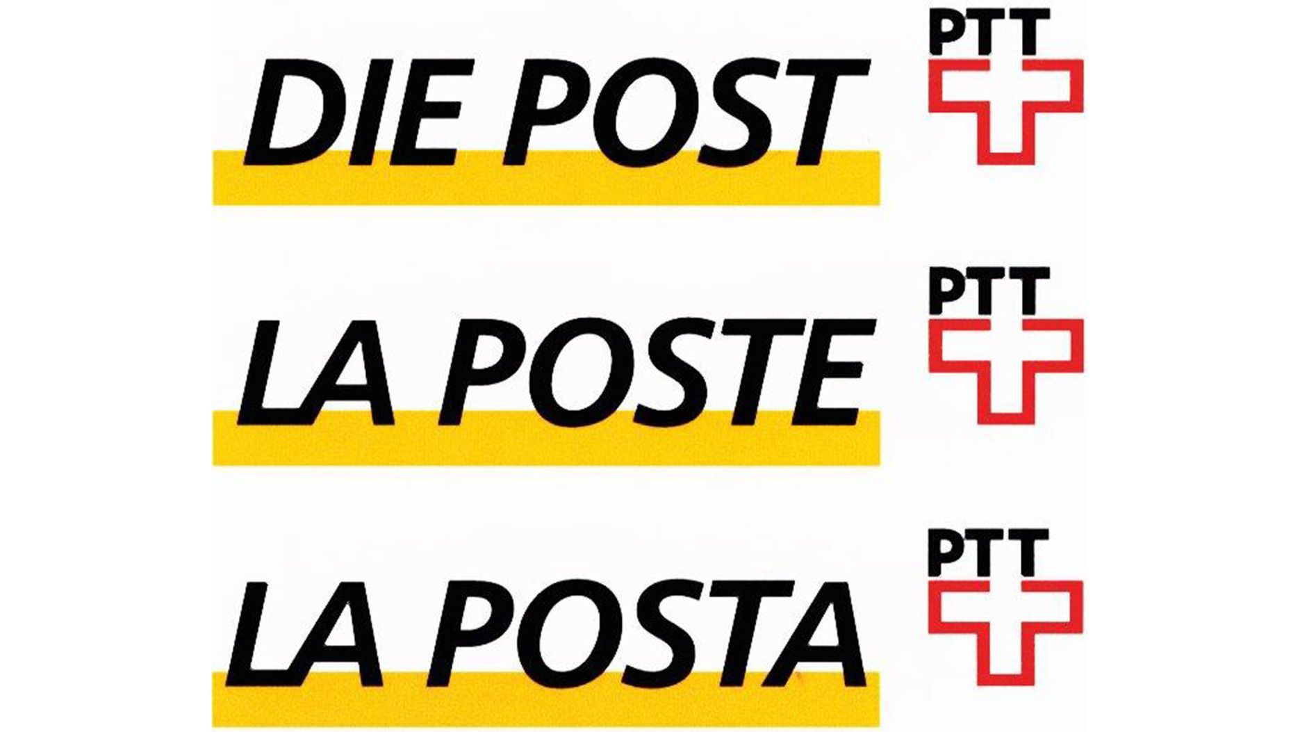
1999: “Swiss Post” with its own identity
For the first time since 1937 the lettering PTT disappears from the logo. The modern adaptation and more openly designed logo by Adrian Frutiger symbolizes the company’s forward thrust. Besides the design modifications, the brand structure is also subdivided into various core units (PostFinance, PostBus, yellowworld) and service units.

2001: Development of flagship brands
As part of the opening up of the postal markets, Swiss Post expands its range of services and develops a strategy with a primary core brand, the flagship brands PostBus, PostFinance, PostMail, PostParcels and ExpressPost, as well as various individual brands. In 2002 Swiss Post obtains trademark protection for the colour yellow as an identifier for its core business.

2009: Together a strong Swiss Post
Swiss Post consolidates its brand portfolio to strengthen its core brand “Swiss Post” and the two flagship brands “PostBus” and “PostFinance”. In Switzerland the core brand and flagship brand “PostAuto” adapt their appearance to the language regions. Internationally the company appears as “Swiss Post”.
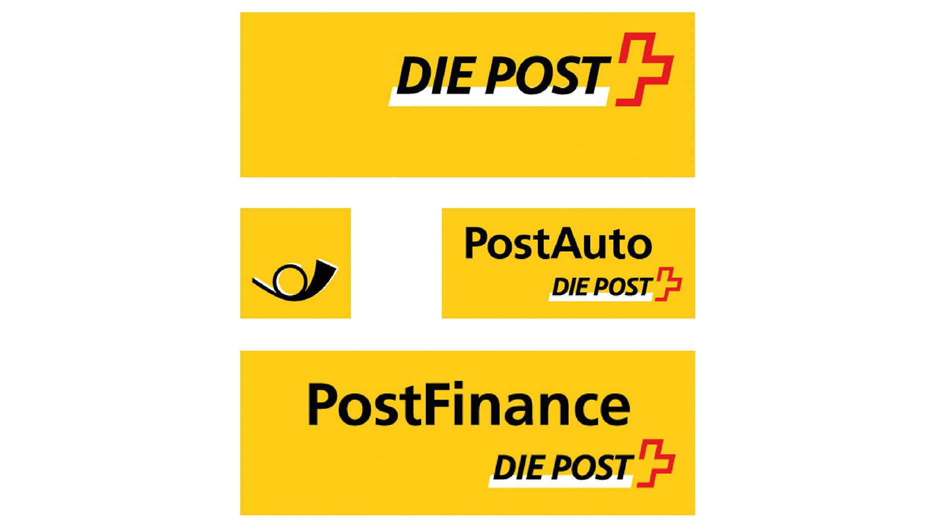
2014
Swiss Post supplements its core brand logo with the new claim “Yellow in motion” to underline its intent to create real added value through innovative services. Swiss Post will continue to target the further development of its brand in line with its vision and strategic thrusts.

2023: The modernized logo unifies Switzerland’s language regions
Introduced in 2023, the new logo builds on distinctive elements from Swiss Post’s 175-year history, such as the Swiss cross and Swiss Post yellow. The new feature is the black “P”. The logo simplifies Swiss Post’s visual identity and is used across all language regions. PostBus Ltd uses the same logo and, in some cases, complements it with the well-known post horn.